AGENTS.md · git:20261028.5d289bb · 2026-10-28 · sha256 8b43f723785faf23
AGENTS.md git:20261028.5d289bbA
Immutable. This exact content never changes and is served at /api/v1/blob/8b43f723785faf23.
# Agent Instructions
**This file is the single source of truth for agent rules in this repository** — Codex, Claude
Code, and anything else editing this repo. They are requirements, not suggestions.
Codex reads `AGENTS.md` directly; Claude Code reads [`CLAUDE.md`](CLAUDE.md), which is a thin
pointer that imports this file with `@AGENTS.md`. Add or change a rule **here**, never in a
tool-specific copy — two copies drift, and then the two agents work from different rulebooks.
# Design System
All Web UI work — layout, color, typography, spacing, component selection, UX behavior — must
follow the [Roami UI design specification](docs/development/ui-design-system.md). Read it before
designing or changing a screen: it defines dark/light colors, layout, dimensions, responsive
classes, desktop workspace behavior, and phone navigation and input rules. Use the
tokens it defines (`--fs-*` type, `--r-*` radius, `--sp-*` spacing, `--accent*` / `--ok*` accents)
and the existing antd/component patterns in `frontend/src/`. Don't invent a new color value, font
size, radius, or spacing step when a documented one already covers the role. Frontend structure
follows [`docs/design/web/04-frontend.md`](docs/design/web/04-frontend.md) unless a newer pattern
already exists in code.
## Keep UI Minimal
Page shells and adjacent layout modules use `--bg-base`, square edges, and no enclosing border,
shadow, or outer card margin. Separate adjacent modules with one `1px solid var(--border-subtle)`
line, owned by one side. This applies to every route, including Home, Files, Browser, Phone,
Projects, Plugins, and Settings. Reserve `--bg-container` and `--r-card` for independent content
cards and composers; controls use `--r-xs` / `--r-sm`, popups use the documented surface tokens.
Never wrap a whole page in a rounded card or use a different background to distinguish sibling
panes. Remote images, documents, and terminal canvases keep their content-specific colors.
UI must be concise. Show the content, current state, and actions needed for the next decision.
Use short, familiar wording: brief action verbs for buttons, direct labels, and one sentence for
routine hints. Keep implementation terms and logs in details; explain errors with a clear next
step. Preserve user input and choices instead of making users repeat work.
Remove repeated titles, obvious instructions, generic introductions, and redundant empty-state
explanations. Use one short empty-state message; hide zero-result counters and pagination when
there is only one page. Lists show identity and essential status; put full errors, revision
history, and technical details in the detail view or an explicit disclosure. Keep necessary
warnings, recovery actions, field labels, and accessible names. Do not replace visible clutter
with tooltip-only instructions on touch devices. Keep primary destinations such as Home tasks
visible and directly reachable; overflow menus hold secondary actions such as debug and memory.
Desktop Home actions belong in the right workspace header when it is open; avoid duplicate task
entries beside the workspace tabs. Phone top-bar task entries are icon buttons with accessible names.
Task lists show a short topic; keep full instructions in details. Task details show descriptions in three expandable lines,
with agent instructions collapsed by default. Put the verified outcome and usable deliverables before execution records. Executor claims never
override task or verification state. Main chat shows task progress and actionable blockers; tool
steps, routing explanations and internal IDs belong in execution records. Ended task details do
not poll; refresh them through events, navigation or explicit recovery actions.
Use existing automatic updates and mobile pull-to-refresh instead of a permanent refresh button
or a toolbar devoted to it. Desktop pages use browser refresh/F5; keep explicit recovery actions
where an error requires them.
## Mobile Material UI
All compact Web pages follow [`docs/development/mobile-material-ui.md`](docs/development/mobile-material-ui.md).
Open content-heavy views such as memories, background tasks, and notifications as full-screen
secondary pages on phones, using `MobileSubPage` or a dedicated route with one return bar and
one scroll container. Reserve dialogs for short confirmations and focused actions.
Keep the top app bar and bottom navigation consistent across routes; put Home, Projects, Tools,
and Settings in the bottom bar. Open messages from the top bar; Home's pending-work summary
opens Projects. A page must not repeat its
route title below the top bar. Secondary pages use one equal-height return bar and one scroll container; URL-backed pages must not also push overlay history. Use the existing design tokens for Material surfaces, type, space,
and state. Verify both bars, safe areas, page scrolling, and a real touch navigation pass on an
Android phone before calling mobile UI done.
## Tokens Only: No Raw Values
The ladders are fixed: type `--fs-micro/meta/sm/body/lg/title`, radius `--r-xs/sm/card/pill`,
spacing `--sp-1`…`--sp-5`, accent `--accent` / `--accent-solid` / `--accent-soft` /
`--accent-border`, success `--ok` / `--ok-solid` / `--ok-soft` / `--ok-border`.
NEVER hardcode a design value that has a token. No `#58a6ff` / `#3fb950` in components — there is
exactly one blue and one green site-wide, and antd's `darkAlgorithm` derives its own shade from
the seed, so a copied hex is always a step off what antd draws next to it. No off-ramp font sizes
(10.5 / 11.5 / 12.5), and nothing below 12px outside eyebrow/badge text.
Top-level pages use `.tt-pagehead` for their header; eyebrow and description are optional and
must add information beyond the title. Don't hand-roll a title row per page.
## Clickable Things Are Buttons
An `<a onClick>` with no `href` is not keyboard-focusable and looks like text — it fails both
discoverability and a11y. Row-end actions use the quiet ghost button `.tt-act` (bare border at
rest, brightens on hover, `.danger` / `.ok` modifiers for destructive and confirming actions).
Reach for `<button type="button">` by default; `<a>` only when it really navigates.
## Breakpoints: One Entry Point
`useLayout()` is the only way to read layout size. NEVER read `window.innerWidth` and never call
`matchMedia` yourself. Pure style differences key off `data-size` / `data-pointer` on `<html>`.
Under a coarse pointer, hit targets are ≥44px — grow the hit area with a pseudo-element, not the
visual size, and overshoot the gap between neighbouring icon buttons by 4px (3px still misses at
dpr 2.75).
## Hover Belongs to the Mouse
Every `:hover` rule is written `:where(html[data-pointer="fine"]) X:hover`. Touch has no
`mouseleave`, so a bare `:hover` sticks to the last thing a finger touched: the previously tapped
button stays lit and a row of buttons flickers as you work down it. `:where()` adds no
specificity, so the gate changes nothing about the cascade. Anything hidden until hover
(`opacity: 0` copy/close/download buttons) needs a coarse rule that keeps it visible, or the phone
can never reach it. `npm run hover:check` (`frontend/scripts/hover-scope-audit.mjs`) enforces both
halves and runs inside `npm run build`.
Tooltips are mouse furniture too: under a coarse pointer `.ant-tooltip` is hidden site-wide,
because a tooltip opened by a long press never gets a `mouseleave` and its overlay then eats the
next tap. An icon-only button therefore carries its name in `aria-label`, not only in a Tooltip.
## The Document Never Scrolls
`html, body { overflow: hidden }` — the app is a fixed-height shell and every page scrolls inside
its own container. One pixel of document overflow summons a 10px document scrollbar, which takes
10px off the workspace and slides the canvas and the terminal dock sideways; on a 150%-scaled
display the fractional rounding flips it back and forth with every burst of terminal output, and
buttons move out from under the cursor between mousedown and mouseup.
## Icons: SVG Only
NEVER add an emoji (🔄 📎 🤖 …), NEVER use a text symbol as an icon
(`✕ × ✓ ▾ ▸ ← → ↑ ↓ ⏎ ■ ● ◆ ⚠ ⎇ ⧉ + …`), and NEVER draw a one-off inline SVG in a component.
- Icons come from `frontend/src/icons.tsx` (24×24 viewBox, `currentColor`, 1.8 stroke, round
caps). `file-icons.tsx` and `git/parts.tsx` hold the file-type and Git sets in the same style;
new icons default to `icons.tsx`.
- The same action uses the same icon everywhere. A close button that is `✕` in one place and `×`
in another is worse than an ugly icon.
- Icons are NEVER baked into i18n strings (`'+ Add task'`). Copy holds words only; the call site
passes `icon={<PlusIcon />}`.
- Status dots and swatches are drawn (`border-radius:50%`, `<Swatch />`), not typed (`●`, `■`).
- Brand marks (`AgentLogo`: the Claude and OpenAI/Codex logos) are the one place our icon rules
step aside. Use the official path data and the official color — `--brand-claude` /
`--brand-codex` — never redraw a logo and never re-tint one to our accent. A brand mark also
gets no chrome: render it bare (`.tt-agentmark`), not boxed in an `ant-tag`.
- Exactly two exceptions: keyboard-shortcut modifier glyphs (`⌘ ⇧ ⌃`), and the swarm office
view's deliberate role-avatar emoji in `Swarm.tsx`.
Self-check: grep `frontend/src` for emoji and the symbol list above before finishing (comments and
TUI-output regexes don't count). A hit is something to fix.
## Internationalization
All new user-facing product text goes through the project i18n layer:
[`docs/development/i18n.md`](docs/development/i18n.md) is the standard. This covers labels,
buttons, placeholders, tooltips, empty states, validation messages, toast/message/notification
text, modal titles, table columns, navigation labels, status labels, browser page text, and
fallback HTML. Allowed exceptions are listed in the standard; if a change intentionally leaves
user-facing text untranslated, say why in the PR or task summary.
# Style
## Concise, Non-obvious Comments Only
- DO NOT be verbose, explain the obvious, or narrate the code. Comments say WHY, not HOW.
- BE CONCISE. One line where one line does.
## File and Module Naming
Never name a file, folder, or module `helpers`, `utils`, `common`, `misc`, or `shared`. Name it
after what it actually contains — the concrete domain concept (`session-identity.ts`,
`terminal-orphan-cleanup.ts`) over the generic role (`session-helpers.ts`, `term-utils.ts`). If
`helpers` feels right, the file probably has more than one responsibility.
## Design Documentation
Keep design proposals in `docs/design/YYYYMMDD-topic/`, with a `README.md` entry point and HTML
proposals, assets, and revision snapshots alongside it. Update the same directory as the design evolves.
Include Product Design, User Stories, and Technical Design, including code and module architecture.
Record acceptance evidence in the matching design directory.
`AGENTS.md` contains durable repository rules only. Do not append design proposals, prototypes,
acceptance logs, task status, or command output here. Link to the relevant document instead.
Keep historical designs and acceptance records in the matching topic directory.
See the [design index](docs/design/README.md).
# Considerations
## The Phone Is a First-Class Client
Every UI change ships to a phone over LAN, not just a desktop browser. Typecheck is not
acceptance: run the real-device pass in
[`docs/development/web-ui-checklist.md`](docs/development/web-ui-checklist.md) before calling a
frontend change done. Touch behavior, coarse-pointer hit areas, and the compact `data-size` layout
are part of the change, not a follow-up.
Serving over LAN also means a secure context: `start.sh` turns on self-signed HTTPS by default
because microphone and clipboard access need it. Don't add a feature that silently degrades on
plain HTTP without saying so.
## tmux Is the Substrate
Sessions are real tmux sessions, and tmux has sharp edges the Go CLI already works around — match
the existing helpers instead of shelling out fresh:
- **Target names are prefix-matched.** Always pass `-t "=" + name`. Without the `=`, a session
named `dev-review` keeps `dev` looking alive forever.
- **Sending to a TUI agent is not `send-keys text C-m`.** That types without submitting. Use
`rt.SendPromptSubmit` (paste-buffer, then a separate Enter), which is also the only reliable
path for multi-line prompts and bracketed-paste apps.
- **`send-keys` has a length limit.** Large prompts go to a file and in over stdin; if the send
fails, kill the session you just created rather than leaking an empty one.
## Session CLI and Test Isolation
Use `roami session` for session operations and `roami chrome` for browser automation. The old
`ttmux` entry is retired. Public session commands do not forward native tmux commands or expose
global shutdown. Close only the explicitly identified session or task resources.
Run development instances through `scripts/dev/isolated-roami.sh <test-directory> <command...>`
and clean up their tmux server through the same entry with `--stop`. The launcher records a private
socket and verifies its server identity before cleanup. Setting only `TMUX_TMPDIR` does not isolate
an inherited `TMUX` target. Never use the user's live tmux server as a test fixture or cleanup target.
The session-isolation regression uses two disposable servers and proves the other server survives.
## Agent Panes Are Not Ours
Claude Code and Codex render their own alternate-screen TUIs inside our panes. Anything that
scrolls, resizes, or replays those panes has to account for alternate-screen mode (mouse-wheel
synthesis, not copy-mode) and for redraw quirks on narrow widths.
## Preferences Arrive Late
`usePreferences()` serves defaults until the `/preferences` GET lands, so the first render of any
component that seeds local state from a preference gets the *default*, not the stored value. Two
rules follow. Gate the one-shot hydration on `preferencesLoaded()`, never on "the effect has run
once" — that flag gets set on mount, before the real values exist, and the stored value is then
silently discarded forever (a dragged splitter kept writing `dockWidth` to disk and kept snapping
back to the default on every refresh). And for anything **visible** — widths, collapsed state —
mirror it to `localStorage` so the first paint is already correct; the server value stays the
authority, it just no longer moves the layout under the user a beat after load.
# Gates
## Refresh Budgets
Session state consumers reuse `useAgentKinds` / `useSessionOverview` rather than polling each
session. New polls pause when hidden, share in-flight requests, and back off after errors; use
`pollWhileVisible` for page-owned polling. Stable data keeps its reference — a new list object
must not restart an immediate request loop. Expensive repository counts refresh separately from
fast session state. Measure production builds before and after; request reduction is not a CPU
or memory reduction claim. Evidence and the next steps live in
[`docs/design/20261020-会话刷新负载/README.md`](docs/design/20261020-会话刷新负载/README.md).
## Quality
- Run `scripts/dev/quality/check.sh quick` before committing local changes.
- Run `scripts/dev/quality/check.sh full` before opening or updating a PR with runtime behavior
changes.
- Scope checks to the affected code. Run Python dependency sync, lint, formatting, and tests only
when Python code, runtime resources, dependencies, or Python test configuration changes; skip
them for frontend-only and other unrelated changes. Local hooks inspect staged changes, and CI
inspects the complete PR or push diff, including deleted files. If the comparison cannot be
determined reliably, run the Python checks instead of silently skipping them.
- Frontend changes must additionally pass
`npm run typecheck && npm run i18n:check && npm run hover:check && npx vitest run && npm run build`.
- Install the tracked Git hooks with `bash scripts/dev/install-git-hooks.sh`; it sets
`core.hooksPath=.githooks` and `commit.template=.gitmessage`.
- Never commit `.env`, generated dependency folders, coverage output, or hard-coded secrets.
## Commit Convention
- Commit messages follow [Conventional Commits](docs/development/commit-convention.md):
`<type>(<scope>): <描述>`.
- The `commit-msg` hook enforces the format locally. PR titles must follow it too — squash merges
turn the title into the final commit.
## Pull Request 必须带截图
每个 PR 都要能**看**出来改了什么,不能只读得出来。文字描述由写的人挑角度,截图不会。
- **界面改动**:至少一张改后的截图;动的是既有界面就给改前 / 改后两张。手机档也受影响的,
桌面与手机各一张——`data-size` 与粗指针那套差别恰恰是最容易漏的一类。
- **没有界面的改动**(后端 / CLI / 插件 / 脚本):截能证明它真跑起来的那一屏——命令输出、
日志、测试结果。
- **文档与规则类改动**:截「这条规则落地之后长什么样」。
放法:仓库是公开的,截图走 `pr-shots` 这条**孤儿分支**(只存图,永不并入 `main`),
正文里引 raw 链接。有脚本,别手搓:
```bash
scripts/dev/pr-shot.sh 253 menu-after.png # 推图,并打印可直接粘的 markdown
```
```markdown
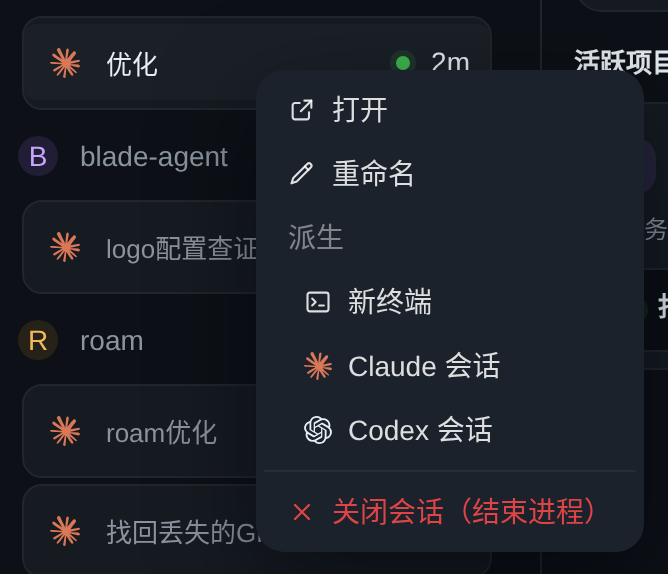
```
脚本用 git plumbing 写(独立索引 + `commit-tree`),不切分支、不碰工作区——截图不该逼你
把手里的活停下来;拉不到 `pr-shots` 时它宁可报错也不从空树重建(那样一推就把之前所有
PR 的图抹了)。
截图不要提交进 `main`:仓库里不留 PR 的一次性产物。
## Code Review
- PRs are reviewed by the **Codex GitHub App** (`chatgpt-codex-connector` bot). See
[docs/development/codex-review.md](docs/development/codex-review.md) for how it is enabled and
how to respond.
- The `babysit-pr` skill (`skills/babysit-pr/`) automates polling, deciding fix-vs-skip, replying,
and resolving Codex review threads.